About SugarDen
SugarDen is a sweet treats business that offers indulgent, bite-sized desserts. Known for its playful tagline and flavorful creations, the brand needed a visual identity that would match the warmth and excitement of its offering.
Services Offered
- Branding
The Goal
SugarDen’s founder came to us with a clear vision but no way to express it visually. She was struggling to create a logo that looked professional, yet still felt personal, fun, and in tune with her brand. The goal was simple – create a logo she could be proud of and that would resonate with her audience.
Project Timeline
The project was completed in one month, with key milestones:
- Defined the brand’s playful, youthful tone.
- Sketches/Concepts: Developed initial logo designs with a pot icon.
- Color & Typography Alignment: Refined the design with vibrant colors and suitable fonts.
- Final Delivery: Provided logo files optimized for all intended uses.
The Solution
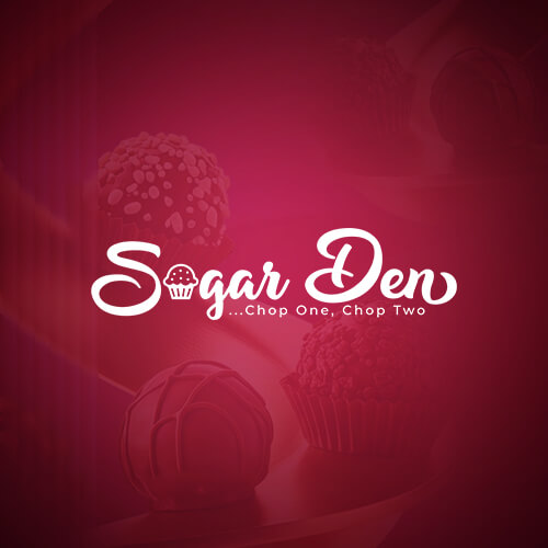
We began by understanding the emotion behind SugarDen – a cozy, joyful place where every bite feels special. Drawing from that, we created a logo that blends playful script typography with a cupcake icon, giving it a warm, handcrafted feel. The deep raspberry tone creates an indulgent yet elegant backdrop, helping the brand stand out without losing its charm.
We also made sure the logo would work well across digital and physical touchpoints – from social media and packaging to signage and merchandise.
What We Delivered
- Logo design with a custom, flowing wordmark.
- Integrated icon that hints at sweetness and fun.
- Brand color palette anchored in rich berry tones.
- Typography system that feels bold, friendly, and feminine.
- A scalable identity ready for growth and future packaging
Results
The new brand identity gave SugarDen a confident, cohesive look that captures the spirit of the brand. It’s now easier for the founder to promote the business with consistency, build customer trust, and explore packaging and merchandise in the future.
More on SugarDen
Tools We Used


Client’s Feedback
Adaure Raphael
CEO, SugarDen
I was struggling to create a logo that felt professional but still captured the heart of my brand. Fuseight really listened and brought my vision to life in a way I couldn’t have done on my own. They were patient, asked the right questions, and made the whole process feel easy and enjoyable. Now, I have a brand identity I’m genuinely proud of.