About KwikRefuel
KwikRefuel is an innovative mobile app that streamlines the purchase and delivery of petroleum products. From gas and diesel to kerosene, the platform empowers users to order, track, and manage their fuel needs with ease. Designed for both individuals and businesses, KwikRefuel solves the everyday frustrations of long queues, uncertain availability, and inefficient expense tracking.
Services Offered
- Branding
The Goal
The brand needed a visual identity that matched its innovative solution.
- The logo had to be modern, recognizable, and versatile across digital and physical touchpoints.
- The identity needed to convey speed, trust, and reliability while differentiating KwikRefuel in a traditional industry.
- The system had to scale — from app icons and social media to delivery trucks and invoices.
Project Timeline
One Month
Key milestones:
- Discovery – Brand research and goal alignment
- Concept Development – Two proposals per brand identity
- Feedback & Iteration – Refinements based on client input
- Delivery – Logo kits prepared for digital, print, and merchandising use
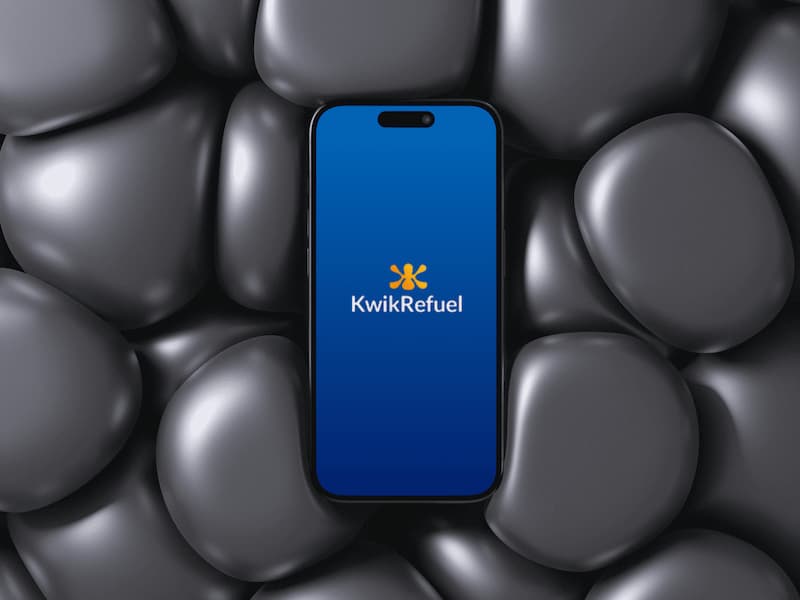
The Solution
We created a dynamic and memorable logo mark built around a fluid, starburst-like form that represents:
- Energy & Motion – symbolizing fuel and forward movement.
- Accessibility & Connection – evoking KwikRefuel’s role as a central hub linking users with multiple petroleum products and services.
- Simplicity & Clarity – designed to be instantly recognizable even at small sizes.
The identity is paired with a clean, modern typeface that communicates professionalism and trust.
Color Palette
We explored a vibrant orange-to-yellow gradient symbolizing energy, warmth, and optimism, balanced with blue and monochrome versions for adaptability across platforms.
Typography & Application
Modern sans-serif typography reinforces approachability and clarity. The system works seamlessly in app UI, marketing materials, and branded merchandise.
Results
- A bold, versatile logo system adaptable across colorways (gradient, dark, light, monochrome).
- A consistent brand voice that aligns with KwikRefuel’s mission of convenience, transparency, and innovation.
- future-proof identity that can evolve as KwikRefuel expands into new services such as car wash partnerships, bulk fuel programs, and renewable energy solutions.
The KwikRefuel brand identity not only sets the stage for launch but also reinforces the app’s promise: a faster, smarter, and more reliable way to fuel. By combining a modern aesthetic with meaningful symbolism, the brand establishes trust and memorability in a highly competitive market.
More on KwikRefuel
Tools We Used